
A Flag 200 Years in the Making?
Earlier this year the powerful political tendency to preserve the status-quo successfully brushed off the efforts to change the Maine State Flag from the current seal-on-blue-background to the original pine-and-north-star. For those of us who would like our civic symbols to be meaningful, unique, and well designed, it was a disappointing, but not surprising outcome.
However, the legislature left us with one tantalizing thread left dangling. They instructed Matt Dunlap, the Secretary of State, to create a special flag to celebrate our state’s upcoming bicentennial (You didn’t forget the the Missouri Compromise of 1820, right?). I gotta admit, I have the commemorative license plate on the front of my car, and apparently he personally designed that, so my hopes were raised.

The commemorative license plate that was conveniently released in the same month that I accidentally destroyed my “chickadee” front plate. Must have been fate.
Fast forward to… yesterday morning, when out of the blue there is an announcement from the office of the SOS that they have created on online poll to gather “public input” on three flag designs Dunlap has put forward for consideration. I hadn’t heard anything of the effort up until this moment (and obviously I am a person who pays close attention to such matters), but I was excited to see what was being proposed.
When I clicked on the link to the poll (really? SurveyMonkey?), I saw the options and felt… well…. frankly a little underwhelmed. Now that I’ve stared at them, dissected them, and compared to other flags, I do feel like a couple of the concepts are rough, but salvagible.
Let’s look at the options, ranked in my order from least to most preferred.
3. Maine Bicentennial Commission Logo

No. Just no.
Official Description: The logo of the Maine Bicentennial Commission, branded as “Maine200,” which uses the blue, gold and red colors of the current State flag, on a white field. The design includes the bicentennial slogan “Leading The Way.”
The Good: Um, well. I guess if you like campaign-yard-signs, you are going to LOVE this design.
The Bad: There is so much text, and so few graphical elements. Frankly other than the Dirigo Star (which is classy, no doubt), the horizontal dividers are probably the most interesting visual element. Also: It has three fonts. Three. Mercifully comic sans does not make an appearance.
The Verdict: This is a logo, a perfectly nice logo. It is in no way a flag.
2. Sec. Dunlap's Ice, Water, and Land Design
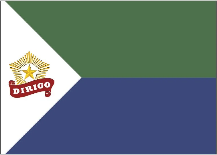
A well intentioned concept, but lacking pizazz
Official Description: Secretary Dunlap’s design, which depicts three fields of color: White represents the hardiness of Maine people as they live, work, and play in a state that resides in the great boreal zone of the north; green represents the forests, farms, and natural beauty of Maine in all times of year; the natural resource-based economy; and blue denotes our rivers, streams, brooks and lakes, and the Atlantic Ocean.
The Good: The colored sections each have meaningful symbolism. The chevron design would be unique to the flags of US states, but there are some good international examples showing this layout can work.
The Bad: Putting the Dirigo Star on a white background robs it of much of its visual punch. The yellow pops much more on a dark background.
The Verdict: It’s funny. I strongly disliked this design at first, but it has grown on me as I analyze it. I have a certain appreciation for the restrained less-is-more approach, drawing on the tradition of many national flags that avoid the clutter of too many graphic elements. In the end I think that it doesn’t quite work. When you have large fields of color, I think you need for there to be a bit more contrast and at least one vivid color choice.
1. Modified Original State Flag

The most ambitious design, but it has some major drawbacks
Official Description: A variation on the original State flag of 1901, this design comprises a simple depiction of a pine tree against a field of blue that represents sky, and lighter blue across the bottom that represents water. This design was submitted to Secretary Dunlap by a Portland resident {Editor’s note: wait, we could submit designs?} and has been modified to include the North Star and Dirigo banner in place of a single white, five-sided star.
The Good: This is a very unique design, to be sure, and an interesting nod-o-the-cap to both the original Maine State Flag and the current version. Dirigo Star looks better on a dark background.
The Bad: The portions and ratios on this flag are so non-traditional that I assumed the image had been improperly resized or some of the flag was accidentally clipped off. Also, the artistic style of the Dirigo Star is starkly different than the highly stylized tree, giving it the feel of a clip-art conglomeration.
The Verdict: Don’t get me wrong, I don’t love this flag, but it’s bold, and has potential. Maybe if the tree spanned the whole height of the flag and the light blue band was a little thicker? What if we simplified the Dirigo Star down a bit to better match the tree? It feels like in the hands of a talented designer it could work as the bicentennial flag.
There is work to be done
In the end I believe either Dunlap’s flag or the Modified Original Flag, after some rework, could make reasonable flags for our bicentennial celebration. My vote in the poll went to the latter because I hoped to send the message to go for a more bold and interesting design, especially given this isn’t intended to be a “timeless” creation. Hopefully the bicentennial flag will be widely flown and then when it comes time to revert to the “official” flag we can revisit the discussion regarding re-adopting the Original Flag ofthe State of Maine.
If you have any thoughts or comments on the Bicentennial Flag, I’d love to hear them here or on one of our social media accounts, and remember, you have until May 17, 2019 to vote in the official poll.